a_lecture_and_an_ibex
| Slideshow ^ |< << Slide 72 of 79 >> >| |
a lecture and an ibex
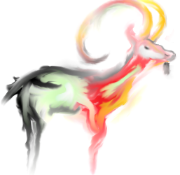
a double whammy page, first my thoughts on the direction the artwork should take and then a little picture of an ibex i happened to have made some years back.
Concept
I know it's a concept that seems to be losing popularity with the ubuntu artwork crowd but i believe that ultimately, although a theme and color scheme are necessary, that they should a) be fairly loose, else the OS risks looking too bland and boring with too little contrast, and b) that the ultimate aim of any OS artwork team should be to create shiny little things and flashy little graphics. when i was looking through the hardy cycle i was often shocked to see really nice mock ups going through a transition of being stripped down to nothingness and block colors by people taking offense to any glassiness or modern effect, the simple truth is this: people like shiny things! they like little clever moving graphics, it doesn't matter that they may slightly decrease usability or be seen as showy, the way i see it if that was the attitude people took you might as well just use a text based os. i, along with most users do not use my computer for advanced astrophysical simulations, i have spare processing power and thus my priority in an OS is that it be nice to use and a little sparkle and glassiness greatly enhance that for me.
Concept Art
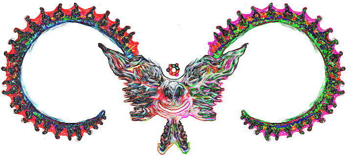
Thought my last one wasn't up to scratch. -Aqaspecification
|
Fullsize Image by aqaspecification |
Ok THIS is the final thing i do this week, anyway bit too psychedelic i think but im putting it up here nonetheless. -Aqaspecification
Wallpaper
|
Fullsize Image by Mariux |
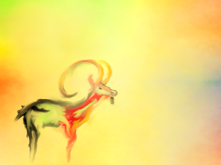
This is a wallpaper made with GIMP using the ibex image by aqaspecification. - Mariux
Wallpaper - with Ubuntu logo
|
Fullsize Image by Mariux |
Wallpaper with Ubuntu Logo - Mariux
Reference
#THIS IS THE PLACE WHERE YOU PUT YOUR REFERENCES
Contributions
Guidelines
- For images, use a low resolution picture in the wiki page. It should be no taller than 240 pixels. If you need to upload higher resolutions, please upload them as an attachment and link to them from the page.
There are two tools located at Artwork/Documentation/Software/Wiki_Scripts to help you with this
Use attachment:thumbnail.png and [attachment:file.png linkname]
Use @SIG@ to leave your signature at the end of your comment. New comments should be placed at the bottom of the feedback.
Comments
* Very nice concept! The colour scheme is absolutely perfect for a new Ubuntu look... Hope that this will become the default image for Intrepid.. I made a concept wallpaper using it.. and in the future i'll add others, if the community likes it or suggests changes - Mariux
* Could you do a new version of the complete walpaper, minus the Ubuntu logo and move the actual ibex more over to the left? (Or post the GIMP Source [xcf] file here?) -/- Rugby471
* I really like how you did the grey here, although I find the reddish stuff rather out of place. (An homage to the Hardy Heron wallpaper? I agree the Fela Kuti style wallpaper is great, but I think the best thing about it was being fresh). Have you tried using the greyish tones throughout the ibex instead of just as half of it, perhaps using the background and more specific regions of the ibex for extra colour? Judging by many of the proposed themes the Intrepid Ibex release will probably feature some dark highlights, so it could turn out fitting very well that way... -- DylanMccall 2008-05-19 15:54:24
Oops! I should add that I don't mean killing the red and orange entirely. Just that right now, the animal appears to be in two pieces, which is rather strange. The horn, for example, does quite nicely with that orange and red style. -- DylanMccall 2008-05-19 15:59:18
I like the first photo very much. Maybe add something to the background besides white?-- Brettalton 2008-06-18 23:07:07
* I like the fresh look, but maybe it is to disturbing for a background?
- Also - I think your Ibex is wonderful for a Fela Kuti-background, made a sketch here:

Inkscape SVG-version: ibex_fela_kuti-ish.svg -- tthorb 2025-11-28 12:32:02
* I agree with your lecture, The ibex looks good too
Attachment List
Artwork/Incoming/Intrepid/a_lecture_and_an_ibex (last edited 2008-10-04 12:02:45 by CPE001cf0f6336b-CM0018c0d8b7e6)
