NewWave
Contents |
| Slideshow ^ |< << Slide 50 of 79 >> >| |
NewWave
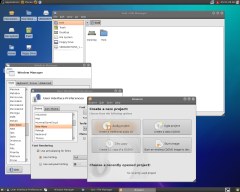
It is time to give a modern look to our favorite distribution! The new theme should make a more clever use of orange than previously (not over-use it), should be mainly color-neutral, and everyting except taskbars and windows borders should be white or light gray for readability reasons and to keep everything less heavy than many existing dark themes. Please read the guidelines of the project.
Palette
A good starting point for the palette (missing some light gray):
Concept
This artwork gets rid of the old-fashion looking GLASSY effect, which was cool 6 years ago. Time to move on!
This is inspired by the Gelatin theme and this XP theme.
The icons used in "places" are not mandatory; I just tried something new, but I'm sure we can find something - not glassy - better.
Concept Art
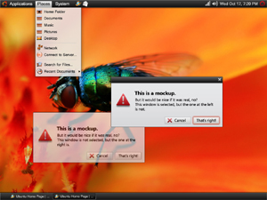
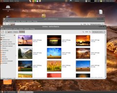
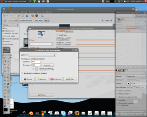
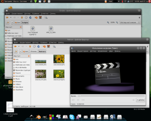
Sorry for the size: this is how it would look like on a 1024x768 screen.
|
Fullsize Image by fde |
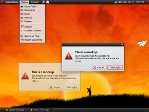
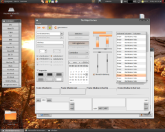
Alternative background (a better one IMO):
|
Fullsize Image by fde |
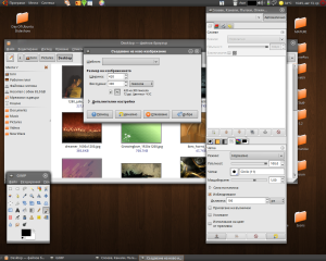
Alternative icons and different glow on the button (the best one for me):
|
Fullsize Image by fde |
Contributions
Guidelines
- For images, use a low resolution picture in the wiki page. It should be no taller than 240 pixels. If you need to upload higher resolutions, please upload them as an attachment and link to them from the page.
There are two tools located at Artwork/Documentation/Software/Wiki_Scripts to help you with this
Use attachment:thumbnail.png and [attachment:file.png linkname]
Use @SIG@ to leave your signature at the end of your comment. New comments should be placed at the bottom of the feedback.
Progress
Compiz and Emerald
As the theme progress we will upload images of the latest version and keep only important steps of its evolution.
The current state of the theme as posting this is 0.5.x. Now the focus is dedicated to the Layered view. (AntonKerezov)
|
Fullsize Image by dilomo |
Metacity
We will upload here the latest images of the latest version with Metacity. The current state of the theme as posting this is 0.5.x.
1. New Wave Pack v0.7.0
|
Fullsize Image by dilomo |
XFce and xfwm4
As of version 0.5.9 the theme has support for Xfce and their window manager xfwm
Welcome Screen (GDM)
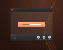
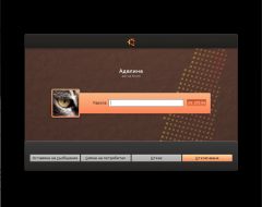
The GDM screen based on DanRabbit's Interpid Ibex GDM:
|
New Wave GDM |
Fullsize Image by dilomo |
Another variant of this same GDM has been made with the Dawn of Ubuntu image for those who prefer the Day of Ubuntu slideshow as wallpaper:
New Wave GDM v0.5 Dawn of Ubuntu
There is page at Gnome-Look.org available too.
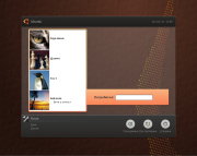
Welcome Screen with Face browser (GDM-List)
|
New Wave GDM Lits |
Fullsize Image by dilomo |
For best results you should specify gtkrc (the New Wave one) file in the first tab of the Identification Screen utility.
Lock-Dialog Theme
This pack themes the window that is shown when you want to unlock you PC. Here's preview:
|
Fullsize Image by dilomo |
To install it please:
1. Unpack files to /usr/share/gnome-screensaver/. You may exclude the README file.
2. Open gconf-editor (Alt+F2, type it and press enter) change the entry apps/gnome-screensaver/lock_dialog_theme from 'default' to 'newwave'
3. Enjoy!
To enjoy this theme fully I recommend using a picture of your choice of size 96x96 px. You could change your current one by going to System > Preference > About Me and click on the button besides your name.
Wallpapers Gallery
|
Lime Light v0.1 |
Fullsize Image by dilomo |
|
"Square" Lines v0.1 |
Fullsize Image by dilomo |
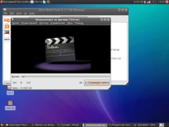
Day of Ubuntu Slideshow Wallpaper (instructions inside). This wallpaper changes according to the current time. I've only changed default time transitions. Full credit goes to original authors:
|
Day of Ubuntu |
Download Edited by PRGUY85 |
Theme Engine
Efforts to customize clearlooks have been stopped. Instead the theme is now based on the pixmap engine.
Downloads
This could be also downloaded from Gnome-Look.org (theme page) or the Launch Pad Download section.
If you want to test the theme (gtk, metacity and emerald themes included):
Download Link |
Description (Changes) |
Fixed many bugs and improved usability for those who work a lot infront of the monitor. Enchansed NW Configurator. |
|
|
|
Older Versions |
|
|
|
Many improvements and bugfixes. New Wave Configurator (GUI) available. |
|
A lot of fixes for more crisp and clear look. Firefox theme included. |
|
Finally fixed Eclipse issues. Improved emerald themes as well as userChrome.css file for Firefox. |
|
Some more tweaks because the previous file contains errors. |
|
New Wave Pack v0.7.2 |
Fixed bugs for Eclipse integration (#318621,#320097) and finally managed to allow different panel sizes: #261360 |
Fixed bug #311311. Many controls have decreased contrast for better usability. |
|
A lot of changes and tweaks to the overall look. For more information see the README file. |
|
Fixed bug #273563. Removed emerald theme v0.3.5 because it is obsolate |
|
Fixed bad looking progressbars inside treeviews. Some fixes on the menubarshadow and metacity restore button. Other fixes. |
|
Totally redesigned Metacity. New panels, better dropped shadow on menubars and menus. |
|
|
New range/sliders. Mini theme added for small screens. Other improvements. |
Moving to dark menus to fix Firefox issue without using userChrome.css. Comboboxes have white menus for better usability. |
|
|
The Main menus is light but requires a patch that will be available in Gnome 2.24 and thus in Ibex. Other bugfixes. |
Redesign and cleanup of Progressbar, Entry, Spin button and Combobox entry. Added some missing images for arrows and range. |
|
All warning messages are fixed. Better support for XFce and xfwm4. Fixed bugs: #263550, #265024 and #265038 |
|
Cleanup of some images. For more info look into the README file. |
|
Redesigned metacity to match New Wave "spirit". New Menu Item and Panel buttons design. |
|
Fixed bug with Appearance dialog crash. New menu style. More title+menubar contrast added. Use Tangerine icon set by default. |
|
Updated metacity to have similar looks with the Emerald themes. Added different arrow style for most controls. |
|
Horizontal line borders fixed as well as few warnings. |
|
Fixed bug #258688 - Default file permissions impede system-wide usage. 0.5.2:Unified color(active, prelight) of scrollbars with buttons. |
|
New scrollbars position and look. Bug fixes. |
|
Totally redesigned widgets and gtk theme based on pixmap engine. |
|
Includes new version of the metacity border theme (0.3). |
|
Include the Firefox/Thunderbird fix as well as some new icons that are not yet used but will be. |
|
Includes Metacity theme. |
|
Unified color of title and menubars. |
|
Darker menubar. |
The latest changes are available in the Launchpad repositories.
Theme Engine (not used):
Known Issues
(Fixed in v0.5.11 and Dark Menus version) Firefox/Thinderbird menubar unreadable text. To solve this you need to put the file userChrome.css in you profile's directory. For Firefox the path is ~/.mozilla/firefox/(xxxx).default/chrome/ where (xxxx) is some text different over installations. For Thunderbird the procedure should be the same.
Help Needed
The theme team needs your help for the following things:
- Testers to try out the theme and find more issues.
- A css/Firefox guru to fix completely the issue with menus in Firefox/Thunderbird
- A man to help with creating a .deb file.
- Icon makers with good artistic skills.
You can participate by joining the New Wave Team at New Wave Theme Suit launchpad project.
Gallery of old versions
- Version 0.6.2
- Version 0.5.0
|
Fullsize Image by dilomo |
- Layered View 0.4.x
|
Fullsize Image by dilomo |
- One whole top 0.4.x
|
Fullsize Image by dilomo |
Comments
Thoughts on New Wave: I'm enjoying New Wave and have been for a while but... I don't like the new window buttons, I have mine laid out OSX style on the left and it obviously looks bad. The old style was fine I thought. Using metacity the 1 pixel window borders make it quie hard to horizontally resize if the app dosen't provide a corner cut out. Most of the gnome apps have this (epiphany, gedit, etc) but lots (eg thunderbird) don't. -- mrjoebain 2008-09-21 16:00:38
To use in gutsy edit the gtkrc file and remove all references to reliefstyle and hint - -- ryanhaigh 2008-05-03 16:23:46
- Honestly, this is really no different and less easy on the eyes as the current theme. It looks still like a 90's operating system.
Would you mind explaining the issues you see, and perhaps providing examples of how this is similar to an operating system from the 90s? By the way, you can use SIG surrounded by "At" signs to sign your comments. -- DylanMccall 2008-05-11 17:18:29
- Yeah, this isn't really any different. I don't see why we aren't pursuing a much better interface, instead of just revamping an old one.
Those are really constructive critics, and moreover they are not signed. People who want to work on NewWave just do, it is one project among others. If you have better ideas, just expose them, build your own team and work on your project. Next time such a stupid comment with no signature is posted I'll simply delete it instead of taking my time to answer it. -- fde 2008-05-03 16:23:46
Try using some better fonts, something similar, but open source, to Myriad. Maybe use some better icons, instead of icons that are still in the same style as icons created in 2002. This could be a bit better just by simple adjustments. -- Acelin 2008-05-16 05:26:26
We are currently working on a new icon theme based on Elementary Icons (see www.gnome-look.org to find them). I agree for the font, but it is really uneasy to find one which looks fine in every case. -- fde 2008-05-03 16:23:46
- This looks too much like Windows before Vista. With the gray, the black bars, and nothing really very different from the old style, this should not replace the current theme. While the current theme is still reminiscent of Windows ME, we shouldn't go further in that direction.
Very smooth looking, I like it. Again, as with most themes, I think you need to stick with Ubuntu colours and not grey, although the first one, with the black menu bar is absolutely beautiful. -- Brettalton 2008-06-18 22:30:37
- I really like the smooth look of the panels, as well as the black color scheme. However, I do not care particularly for the use of a black border along the tops of your active windows, or the look of the close, minimize and maximise buttons. The black border along the top looks very much like a Microsoft holdover -- it would look better with one uniform panel treatment. Also, you should make your close, minimize and maximize buttons more distinct. I personally am prone to the Ubuntunion theme's corner window buttons -- perhaps you could try something like that. Keep up the good work! -- Brian Fleeger 29 June 2008
- Unlike the comment above I really like the close, minimise and maximise buttons on your version 0.4. They are very clean (white on a dark background) which seems to be the way that much UI design is progressing. Infact I would like to see all icons in a theme monochrome and bold. The other reason I like them is that they have a small and suitle reference to the circles in the unbuntu logo which has been lacking in past themes. Keep pushing the norm with this design. --Drew
Not a huge fan of your glow effect to highlight selected widgets. It's better than a dotted line (anything beats that!), so I appreciate that you are going for a solution, but I don't feel that this really fits with the rest of New Wave. It feels like something from a fuzzy, cloudy and glossy theme, whereas New Wave is (for me) more sharp-edged and opaque. While it sounds a bit boring, I think a sharper highlight similar to what the Clearlooks theme does would be an improvement... -- dylanmccall 2008-08-17 15:59:13
It may not be very cool but right now this is the only way of doing acceptable focus on widgets. If I use a standard rectangle it looks ugly. Do you have any ideas how can we make it more appropriate for New Wave. Btw you should put comments on the end not at the beginning. -- AntonKerezov
- I like the theme, especially the panels and the "File Edit View..." line (how it's called?), but I would like to see more use of orange, or other colors than gray, to make it more lively. Well done. for now it's a keeper.
Its called menubar. The theme is intended to be more color neutral to allow us concentrate on the contents not on the theme. And it will become more lively with a colorful and well established icon theme like Elementary or future Human themes. -- AntonKerezov
There is not gtkrc file in NewWave GDM List. So, I can't apply additional configs. -- [JuliánAlarcón].
- Yes you are right. But if you have New Wave installed you will have the gtkrc file in your theme installation directory (e.g. "~/.themes/New Wave/gtk-2.0/").
Attachment List
Artwork/Incoming/Intrepid/NewWave (last edited 2010-02-28 10:50:00 by 78)
