Release_with_a_dark_theme
| Slideshow ^ |< << Slide 57 of 79 >> >| |
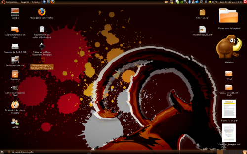
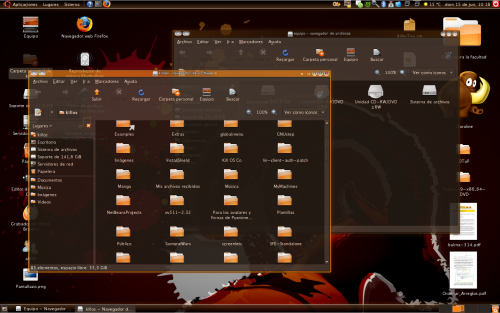
Release Intrepid Ibex whit a dark-brown theme.
Concept
A lot of people want a dark theme on ubuntu, and I think that is a really good idea. The actually "human-theme" is very nice, but a lot of people like me n_n is finding something more. The screenshots are something I do with my desktop, under Ubuntu 8.04. The theme I use for that is "human-murrine", but I change all the default colors. The icons are, of course: Human icon theme, and the panel is my mod of Ebony-Panel. Maybe this can offer something for the designers.
Palette I don't have any color pallete, sorry...
Concept Art
Dark Theme Usability Issues
A dark theme included as the default image of Ubuntu should be frowned upon. While some users appreciate a darker look, dark items in general have very large usability issues.
Examine the image below. You should be able to read it very well. You eye should be attracted to the header because of it's size, and "white space" positioning.
|
Fullsize Image by Ryan Henningsen |
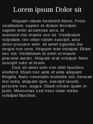
In comparative, the image below, while formated in the exact same way, should be much harder to read. Our eyes don't react do a black canvas with white text as well as it does to a white canvas. Our brains our designed to ignore white space and look at items that are darker or contrast their background.
|
Fullsize Image by Ryan Henningsen |
It's for this same reason that people but backlights behind their monitors or televisions. The light allows your pupils to relax and not have to strain as much to see the color of your screen in a dark room.
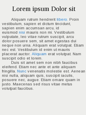
Now, look at the next image.
|
Fullsize Image by Ryan Henningsen |
Where did your eyes go first? I can guess. You probably looked at either the blue accented text or the header first. It's for the same reason that a theme should be minimally invasive to a users experience. It's hardwired into our minds and is reflected in media all around us. It's akin to going out in the dark with a single bright flashlight and trying to find items outside. It's the same way with a dark theme, your mind and eyes have to work harder to find what they're looking for. The theme should contain little contrast in general with color or dark items placed to draw your eye.
Reference
Contributions
Guidelines
- For images, use a low resolution picture in the wiki page. It should be no taller than 240 pixels. If you need to upload higher resolutions, please upload them as an attachment and link to them from the page.
There are two tools located at Artwork/Documentation/Software/Wiki_Scripts to help you with this
Use attachment:thumbnail.png and [attachment:file.png linkname]
Use @SIG@ to leave your signature at the end of your comment. New comments should be placed at the bottom of the feedback.
Comments
- This is really nice. Can you please attach the image? (Right now, only the screenshots are attached.) -Aantn
- I like the wallpaper a lot, and dido for the theme, but they're both just slightly too dark. If you could lighten them up slightly, maybe just by adding some contrast, I think you'd have a fantastic theme on your hands.
- I think that this should be a pretty high priority. It is currently a nightmare to make a dark theme, especially when your color scheme clashes with app defaults (ex: dark window colors require light font colors obviously for contrast. But many apps/websites are light backgrounds, so you type white font onto a white background. Another random example - in VLC, the play/pause/etc buttons are black, and in a dark theme is nearly impossible to see the buttons.) -rd
"In comparative, the image below, while formated in the exact same way, should be much harder to read." Should be, but it's not. It's actually much, much easier to read. The contrast seems higher, even if it isn't, so that the letters stand out better. With black on white, the edges blur, and the text becomes hard to read. Additionally, if you're in a dark room, the white background just plain hurts. -- maco.m 2008-08-21 15:18:33
Attachment List
Artwork/Incoming/Intrepid/Release_with_a_dark_theme (last edited 2008-08-21 15:18:33 by 66)


