Intrepid_Ibex_Font_-_Art_Team
| Slideshow ^ |< << Slide 34 of 79 >> >| |
A New Font for Ubuntu Intrepid Ibex 8.10
This is a wiki page for the art team and who else to show off open source fonts as suggestions for the default fonts in Intrepid.
I have discussed the state of the look of Ubuntu with Mark Shuttleworth, and he suggested using the following procedure.
Use the art team to develop wiki's displaying unified work towards three areas: 1) Fonts, 2) Icons, and 3) the Theme.
We will list several options on the wiki, along with guidelines. We will then discuss the options, narrowing them down to a few choices. These wiki pages will be used to then show Shuttleworth the Art Team's work.
Salane Ashcraft salane89@gmail.com
Fonts: https://wiki.ubuntu.com/Artwork/Incoming/Intrepid/Intrepid_Ibex_Font_-_Art_Team
Icons: https://wiki.ubuntu.com/Artwork/Incoming/Intrepid/Intrepid_Ibex_Icons_-_Art_Team
Theme: https://wiki.ubuntu.com/Artwork/Incoming/Intrepid/Ubuntu_8.10_Theme_-_Art_Team
Google Droid
This font has been discussed by the Art Team much lately, and show great promise. The only problem right now is making sure it is completely open source.
Download Link: http://benno.id.au/blog/2007/11/14/android-filesystems Note: download the system.tar.gz, extract, then paste into a new folder in your fonts folder.
Red hat Liberation
This font was developed by Red Hat for use in the Linux world. These are very good fonts.
Download Link: https://www.redhat.com/promo/fonts/
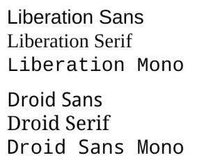
Google Droid and Red Hat Liberation Fonts
|
Fullsize Image by Google and Red Hat |
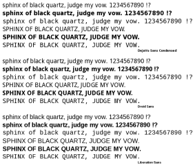
DejaVu Sans Condensed
What happened to the discussion about D.V.S.C. being the default font and why are we considering a font that *might* be open source one day?
|
Fullsize Comparison of all 3 proposed fonts |
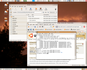
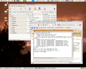
Here's how my desktop looks with DejaVu Sans Condensed and Droid:
Both fonts are 9pt, RGB & Slight hinting.
I think Droid looks decidedly less modern with its Serif capital "I". And it's even more condensed than DejaVu Sans Condensed, which was the main complaint of the original thread about changing the main font.-- vyruss 2008-07-08 23:04:52
More screenshots: Droid Sans 9pt with no hinting, grayscale smoothing Droid Sans 9pt with slight hinting, grayscale smoothing DejaVu Sans Condensed with slight hinting, grayscale smoothing
Comments
- I agree the Liberation fonts are more compact than Droid's, and in that regard look better. However, Droid clearly distinguishes between a capital letter "i" and small letter "l". Liberation does not seem to make any distinction from what I have seen, which makes it less convenient -- especially for anyone trying to copy terminal commands off what they read from another window. Just my two cents. -- Brian Fleeger 7 July
- I don't see the "i" vs "l" issue in either Droid, Lib, or Deja...Serif, Sans, or Mono. I do notice however that Droid Mono lacks a marked zero, to distinguish it from an "O". Deja Mono and Lib Mono both have dotted zeros. --Ashton
As you can see from the comparison I posted above, DejaVu appears to have the biggest x-height and should be the most legible. Personally I find DejaVu more modern than either of the other two. I also agree with the comment about Droid Mono having an O-looking zero. All fonts are 25pts. -- vyruss 2008-07-09 06:19:21
These three font families are very similar. Droid is open source, Liberation is too, so that isnt a question. Deja Vu is very clunky - while Liberation looks slightly less refined than Droid. When using these on your computer or extensive amounts of time, there is absolutely no readability difference in any scale. However, there are other things to look at. Droid certainly is spaced the best, and looks the nicest with the same font settings compared to the other two. The font with the best International support I think should be chosen, however - we cant really go in the wrong direction with any of these fonts. -- Acelin 2008-07-09 23:27:05
Another two notes: The capitals in Lib are huge, the "compactness" goes away as soon as you use even one capital. Second, to Acelin, Droid is currently under a proprietary EULA and is rumoured to become open source one day. -- vyruss 2008-07-10 04:09:25
Droid will be open sourced when Android comes out. We are currently talking with Google to open source it now. -- Acelin 2008-07-10 19:05:29
- To evaluate the right font family to use for Intrepid, there are many more aspects that have to be evaluated than can be seen in a few screenshots or by looking at the license.
Unicode coverage. This is a very important criterion. Ubuntu is a globally used system and we can expect people to mix a lot of different scripts on their screens. If the default glyph set is small, then there will be fallback substitution all over the place for Unicode ranges that are not covered by the default. Compare the number of glyphs in DejaVuSans vs. Droid Sans.
What type system is it? In OpenType, many more international languages and scripts are accomodated. Serbian and Russian cyrillic are different in a few glyphs. Does the font accomodate the distinction? OpenType provides more typographic features like real small caps, etc.
Legibility. Large sample settings with point sizes above 16 do not say anything about readability. Evaluation has to be done right on the desktop with all possible rendering modes. The font family has to be robust across all these modes. Grayscale antialias vs. LCD antialias, strong hinting vs. no or slight hinting. There are big differences here. How is the font internally hinted? Does it have high quality hinting instructions. What type of instructions are best for FreeType and Cairo? What are good for Xft and Qt? Evaluate different font sizes and not only the default size. Strong hinted text looks only good if the mathematical stroke width does not deviate to much from 1.0 px, inbetween the distortion get's very noticeable. On the other hand, some fonts are better suited for slight or no hinting because of their characteristic outline shapes. Test a whole range of font sizes (8-16pt), not only default.
- How comprehensive is the family? Are all font shapes we need present (bold, medium, italic, small caps). How many weights come with it? n.b. There is no Droid Italic!
--TobiasWolf 2008-07-19
This video about Droid is interesting because it outlines the importance of taken the renderer into account: http://youtube.com/watch?v=rxbzE_JAs3A
(skip to time 36:30) --TobiasWolf
This is a typical usage screenshot of Gnome with Droid LCD filtering and slight hinting
Attachment List


